Coles
Coles: Liquorland Redesign
Liquorland and Vintage Cellars were both redesigned during my time at CHE Proximity both of which I was involved in from an end - to end product design. The client was looking for a natural yet disruptive experience for their user’s and ideation included designing for components as well as at a holistic level with assets created for cross functionality between the brands. The user’s for Vintage Cellars had a level of exclusivity compared to Liquorland which was for an ‘everyday’ shopping experience and the experience around membership, gamification, status were also explored.
Liquorland
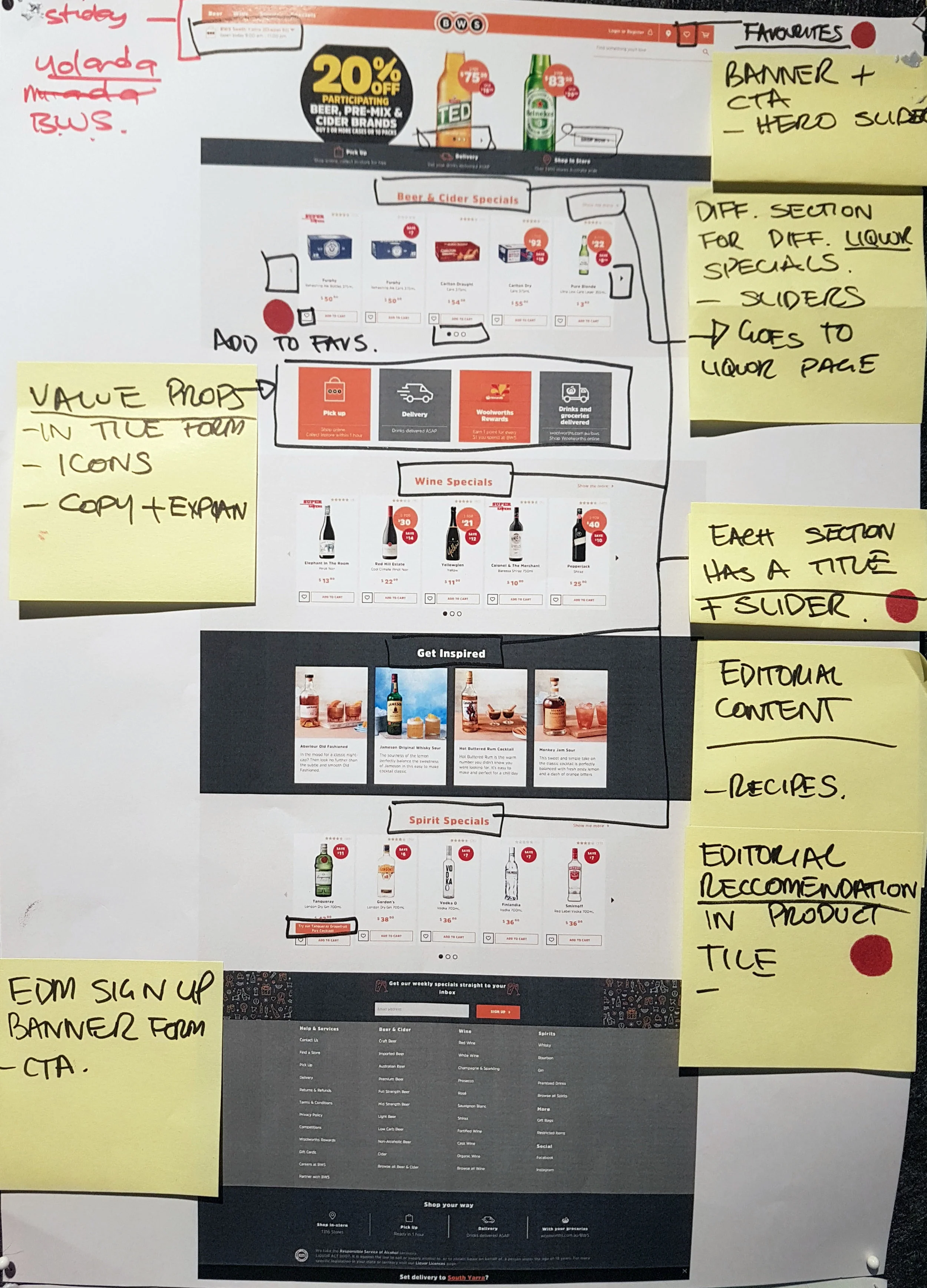
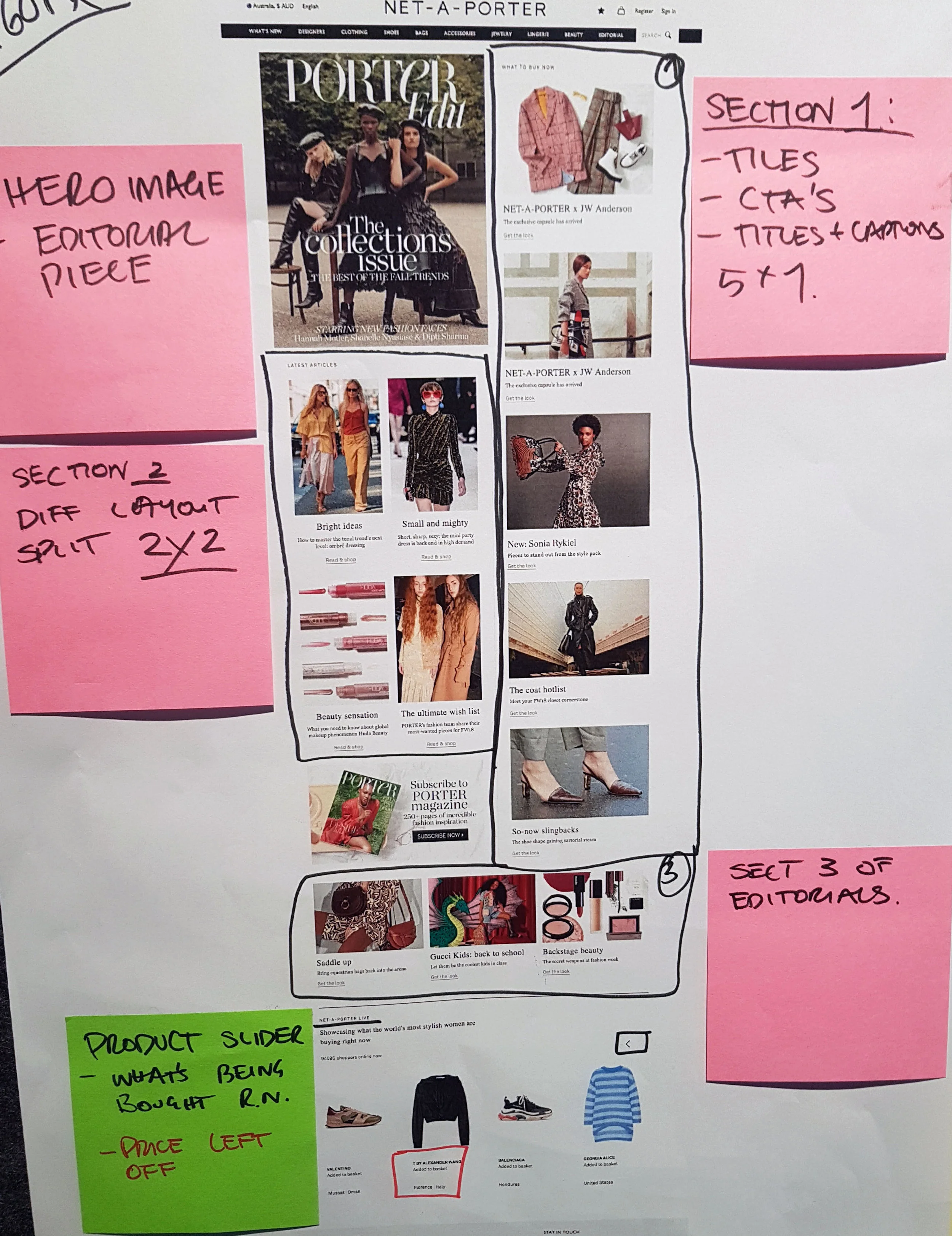
Competitor Analysis was conducted for Liquorland with other liquor retailers in the same class and also Net a porter which the client requested for it’s similar design. However this was found to be not in the same class because Net a porter did not display prices upfront suggesting that unlike Liquorland their user’s were not driven by price.
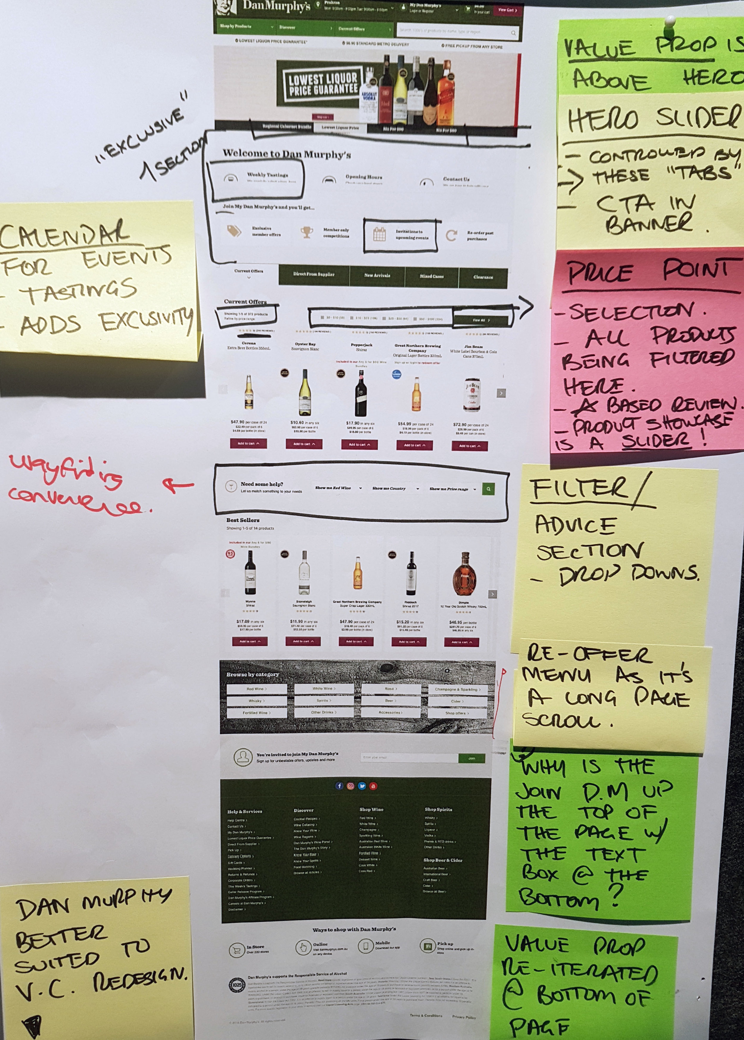
Ideation of “Disruptive” components
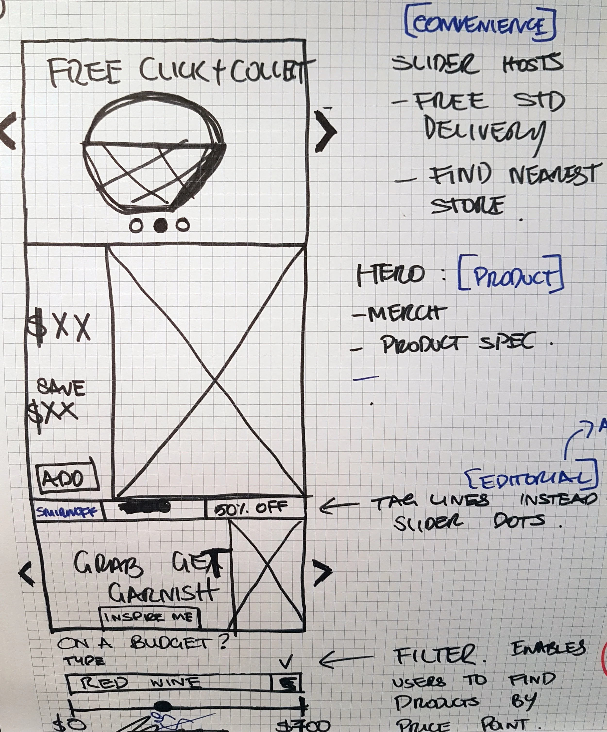
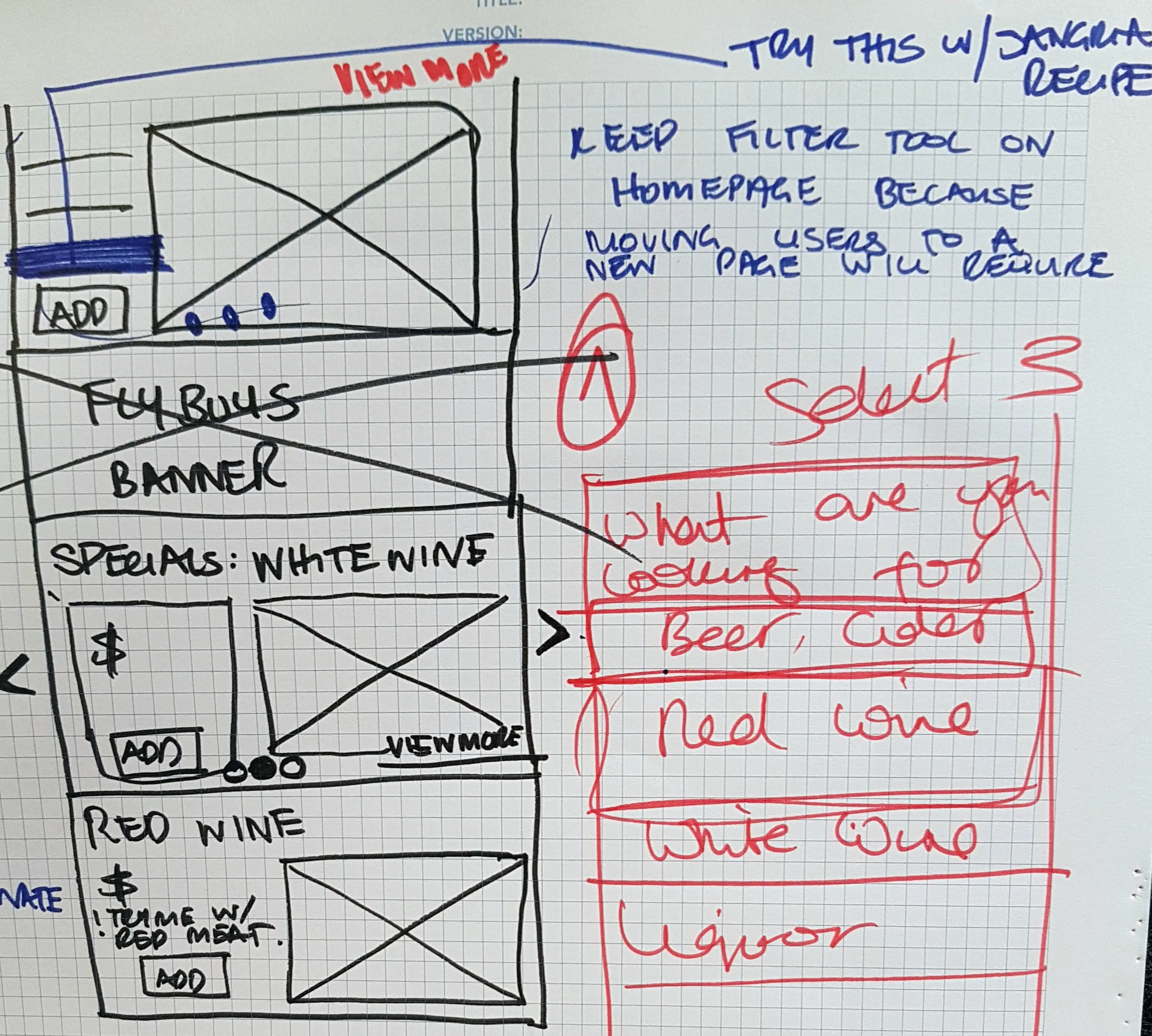
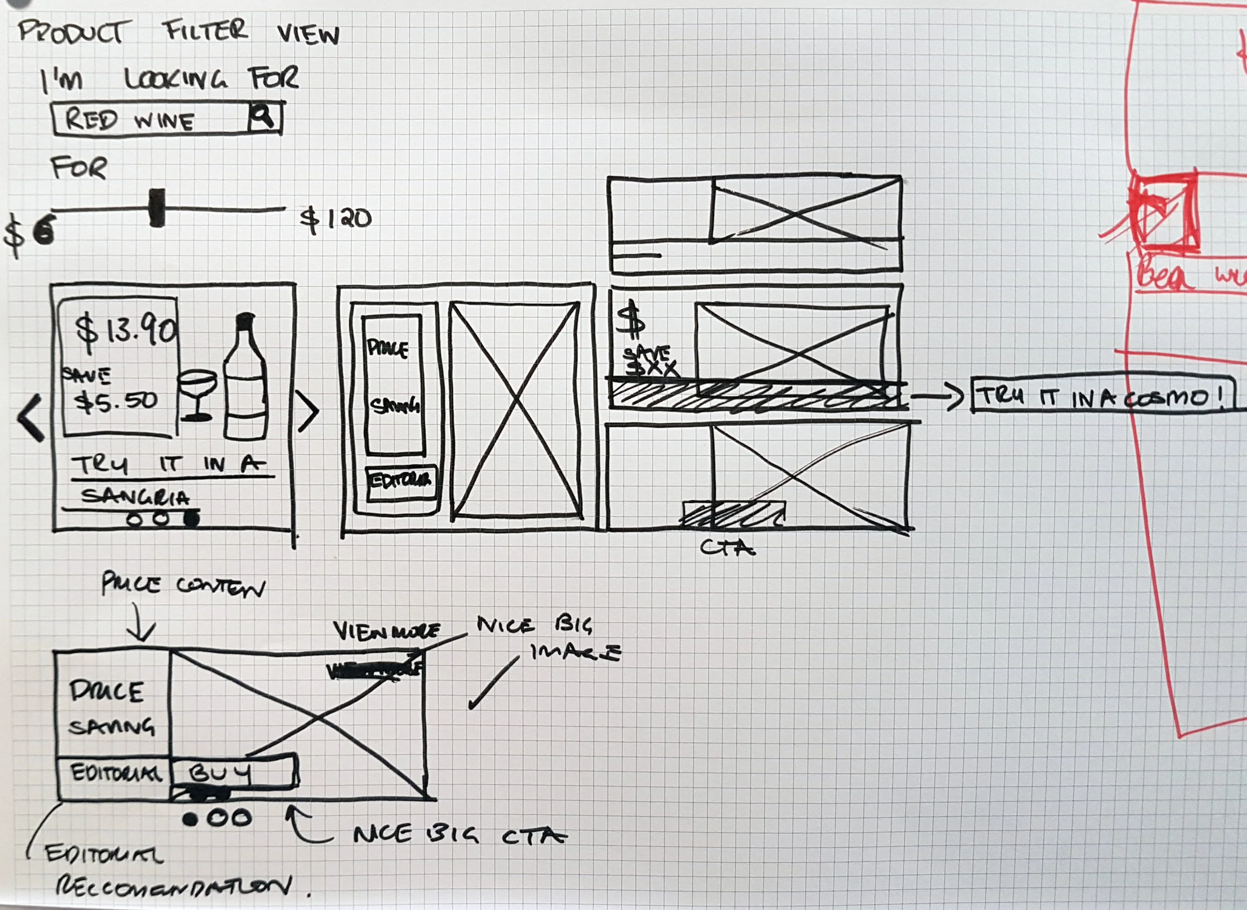
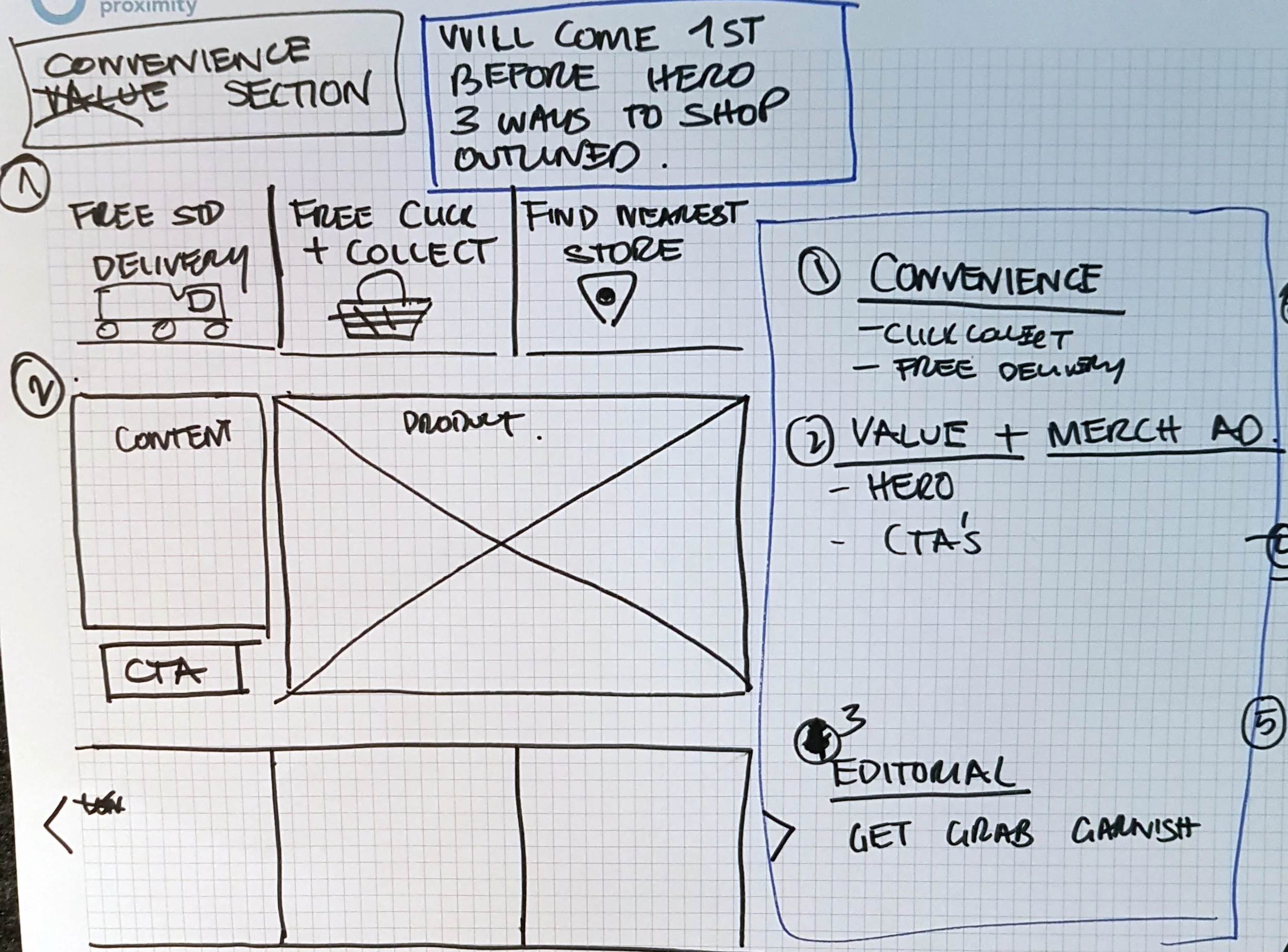
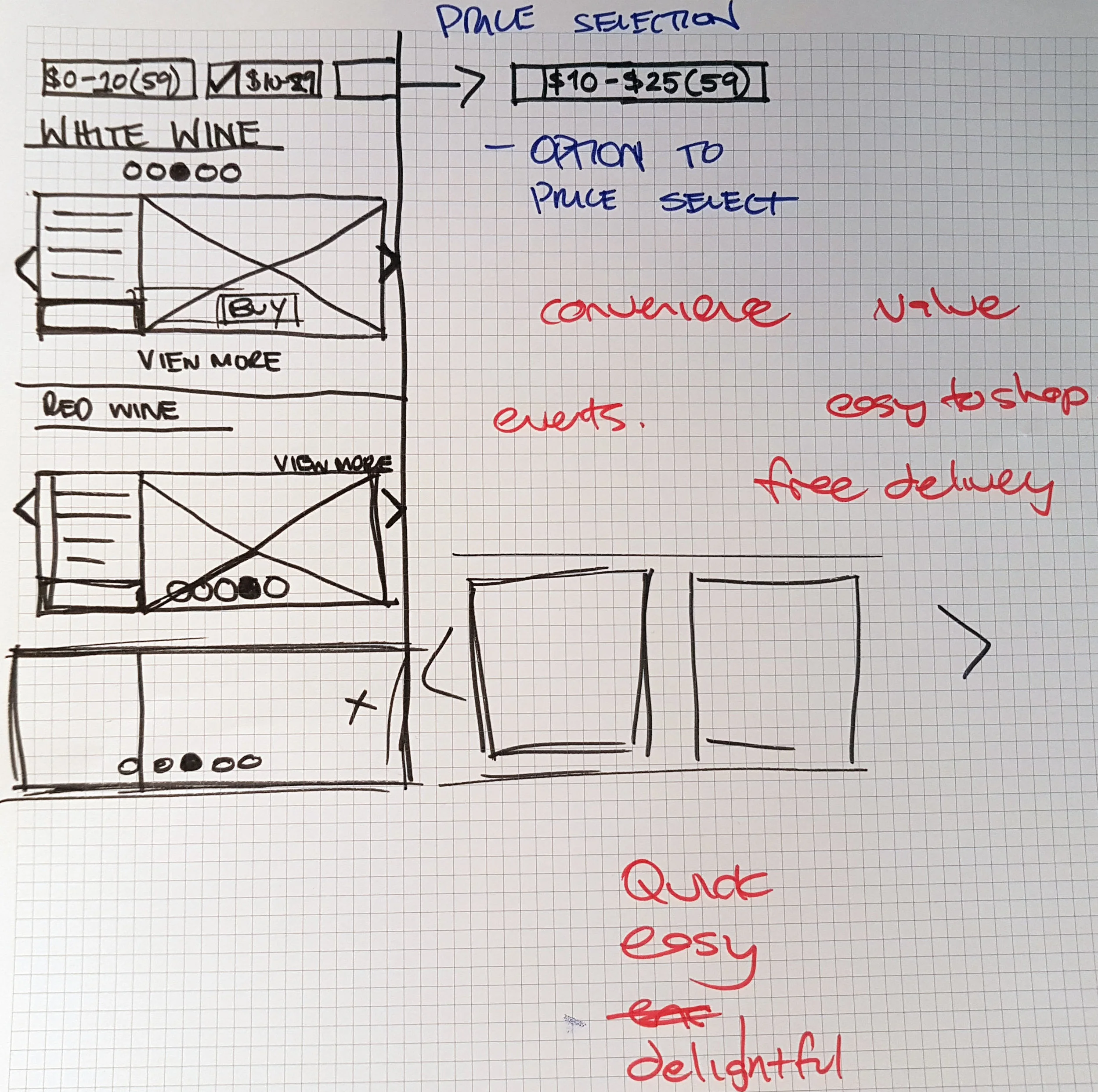
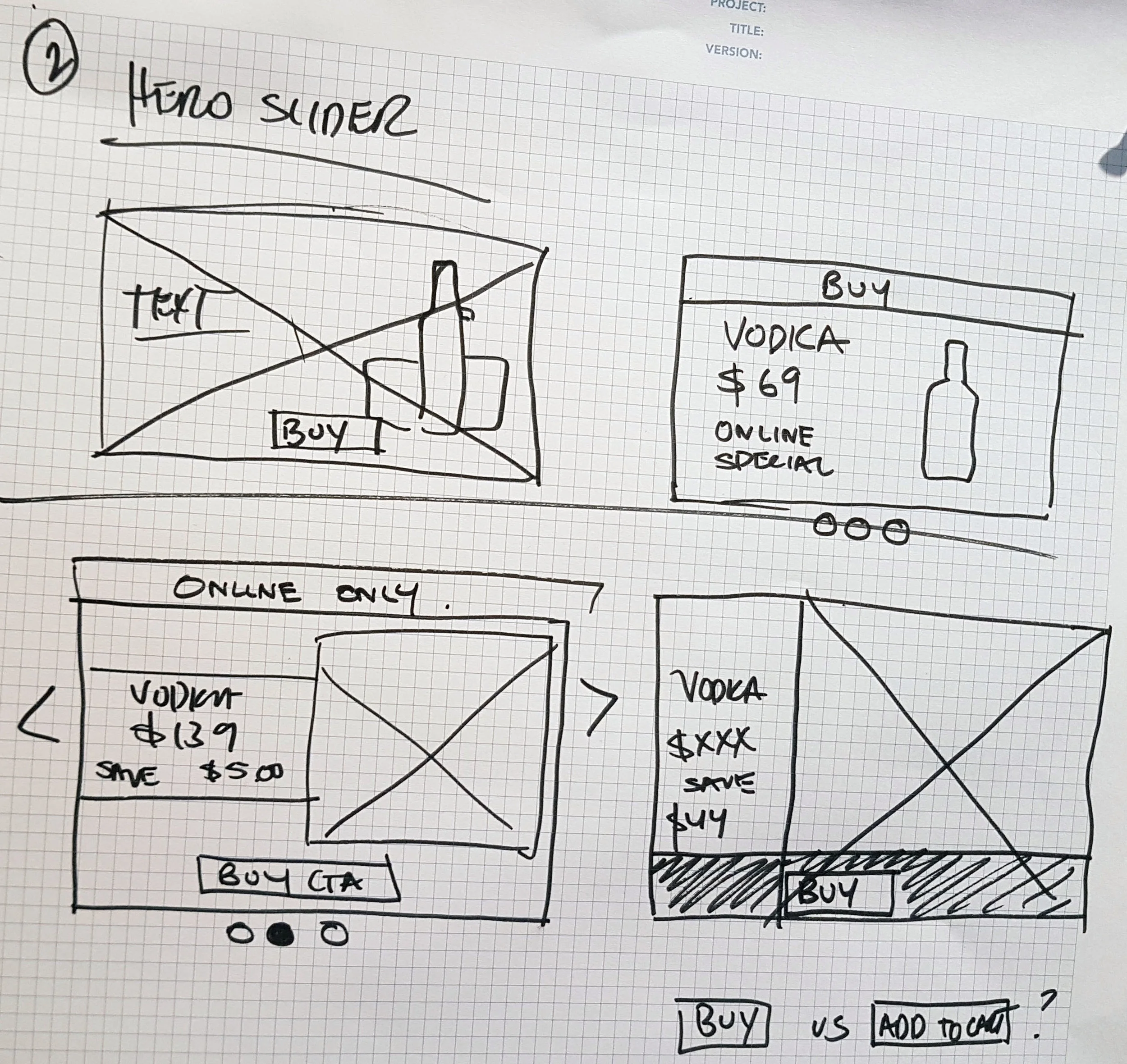
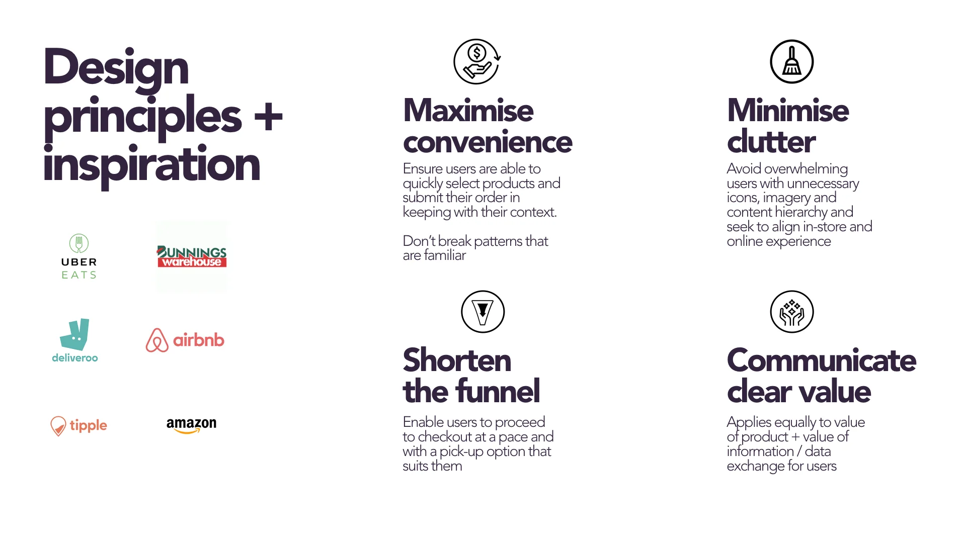
UX Principles and Objectives that were met in this redesign
Vintage Cellars
Redesign for both Vintage Cellars was run alongside Liquorland so as to create and innovate experiences with cross functionality between the two websites. This meant that while a lot of the UX had been heavily processed for Liquorland in the discovery phase the elements which were better suited to Vintage Cellars were moved over to that project. Vintage Cellars as a brand has an air of exclusivity and sits in a top tier class with Cellar press and wine club memberships offering customer’s a personalised and sophisticated experience. This was reflected in both the components created for user for a more mature demographic but also in the look and feel of the editorial and blog content pages.
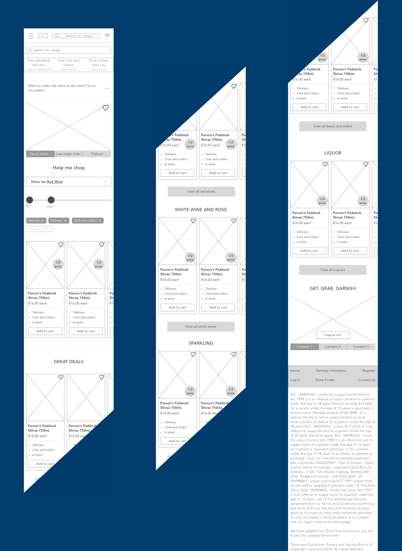
HOME PAGE
Navigation received a sleek, minimalist design similar to Net A Porter. The random tiles present critical information above the fold. With a large centred search bar being inclusive of the need to cater to an older demographic. Campaign material receives large banners which in the final design phase also included a version where that space was used to display catalog items.
SUB -CATEGORY PAGE
Filters were experimented with to float relevant material to the top of the page, or to anchor user’s to relevant sections. This page served to showcase “Best sellers”, “Trending”, “Gifts” etc. to user’s and served up content relative to the type of liquor they had navigated to using the top navigation. Sticky navigation, store locator and search bar are visible throughout the website.
CATEGORY PAGE
The category page is essentially the “product page”. The user has now selected a type of liquor or wine and has arrived at their results. A standard filter is provided on the left panel so user’s can browse regions, brands and price range. As ideated in Liquorland, the favourite star trigger’s a sign up for personalisation and user’s are logged in and are served with a “member view”.